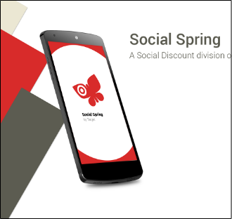
A Discount & Shopping Buddy Mobile App
Goal
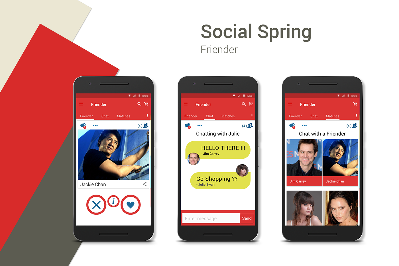
For this project the Target executives gave my team a budget of 1 million dollars to create a new discount mobile app based on the existing Target mobile app called CartWheel. However, for this app the executives want me to add a section called “Friender” that is based on Tinder. The new “Friender” section of the app will allow more adventurous shoppers to meet brand new shopping buddies in the safety of the brick and mortar store with the protection of security guards to prevent any unwanted altercations. The new “Friender” section will allow for shoppers to add already existing shopping buddies to their app as well.
To make the test for this mobile app more accurate the team will have the mobile app tested in two target stores. One store in San Jose and Another Store in San Diego. Both the San Diego store and the San Jose store will be close to nearby stores that will not have the mobile app activated and therefore act as a regular normal everyday store that will be great for making a comparison of sales.
To make the test for this mobile app more accurate the team will have the mobile app tested in two target stores. One store in San Jose and Another Store in San Diego. Both the San Diego store and the San Jose store will be close to nearby stores that will not have the mobile app activated and therefore act as a regular normal everyday store that will be great for making a comparison of sales.
Expected Result
The result the team expects to see is that shoppers will meet new shopping buddies and bring existing shopping buddies, resulting in more time spent in the Target store and creating more overall sale product and non-sale product sales.
Actual Result
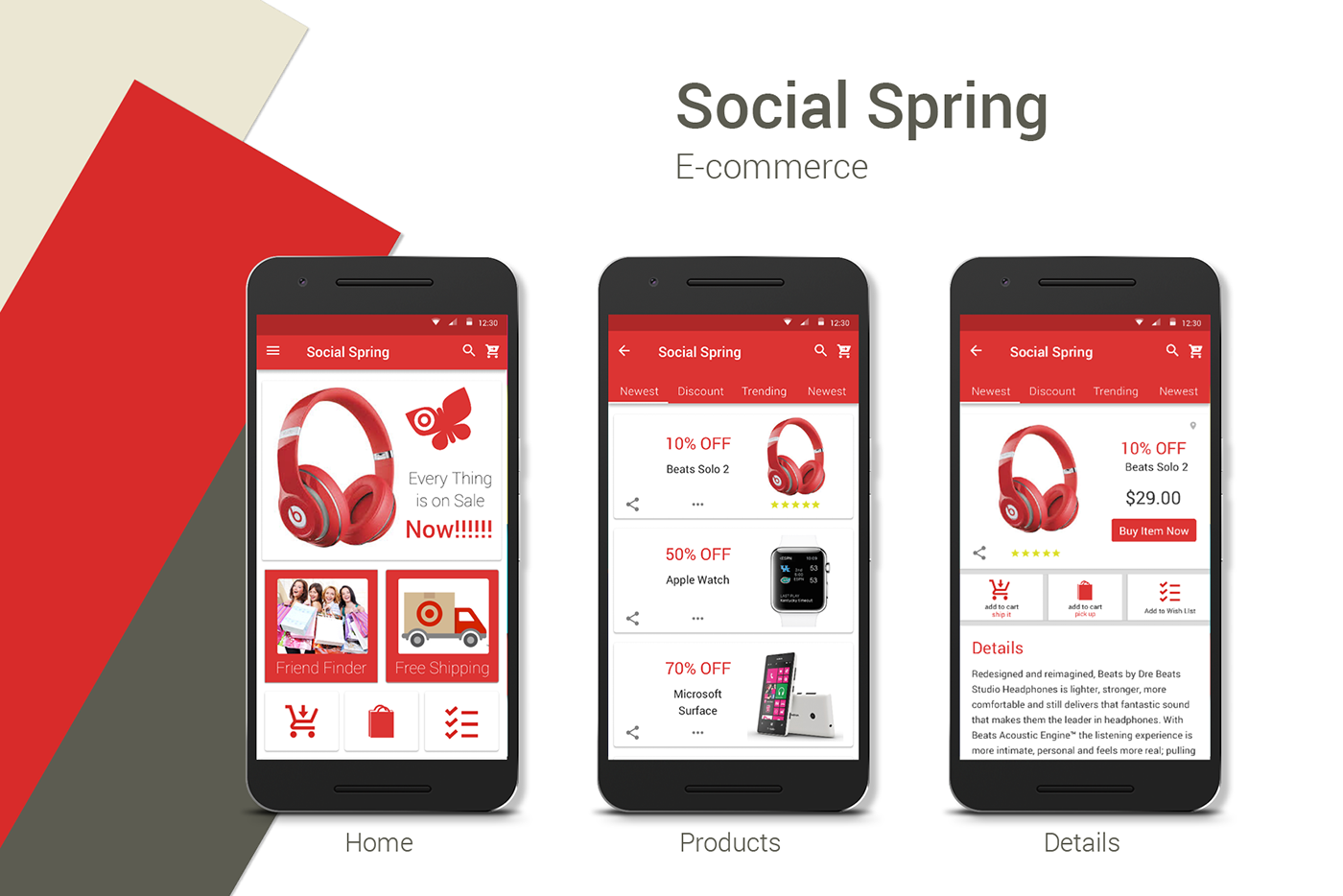
The actual resulting activity from shoppers using the new “Social Spring” mobile app went beyond what the Target executives and Target mobile app team could ever have imagined. The most surprising result was that sales not only increased in the stores that made the mobile app available to shoppers, they actually tripled. This was a sales result that went way beyond what the mobile app team expected. The social “Friender” section of the app was an extreme success. As of this date, over 500,000 shoppers have met each other in the two target stores. The new “Friender” section of the mobile app was such a success that the Target brick and mortar stores had to stay open an extra hour longer. The shopping buddies were having such a good time they did not want to leave.
In fact the entire Target mobile app team has been invited to a wedding from a couple that became shopping buddies on the first day the “Social Spring” mobile app was released.
In fact the entire Target mobile app team has been invited to a wedding from a couple that became shopping buddies on the first day the “Social Spring” mobile app was released.
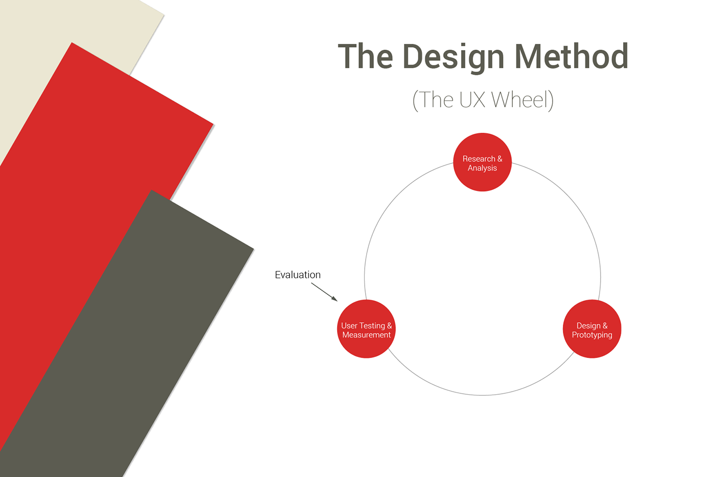
Process Overview - The UX Wheel
The process that is used to create the “Social Spring” app revolved around the concept of the UX Wheel. The process is made up the three phases that can be viewed below.
Phase 1 - Research & Analysis
The research and analysis phase is where learning about the product takes place. It is where the team figures out who the target market is. This phase is also used to figure out what information is most pertinent to the architecture of the website. To accomplish this I studied case studies from similar projects created by advertising agencies and used various ethnocentric research to come up with new ideas for the mobile app.
Phase 2 - Design & Prototyping
The design and prototyping phase is where the creation of wireframes and animated prototypes are created.
Phase 3 - User Testing & Measurement
The user testing phase is where the prototype simulation is tested out for issues by 5 users using various testing techniques. Most importantly the testing method called “Over the Shoulder Observational” testing.
Research - Investigate (Phase 1)
Interviews
To begin the research the entire UX Team went out and interviewed many workers that worked for target. The UX Team first interviewed the managers, next the UX Team interviewed the clerks and thirdly the UX Team interviewed workers from each of the various Target departments. The interviews were extremely enlightening and allowed the UX Team to gain new ideas and understand how the entire Target business model works.
Embedded Research
The UX Team spent two weeks working for an actual Target brick and mortar store. Next the UX Team split up to work for all the various Target departments. This was beneficial for the team to learn more about how the Target department stores work and to allow the team to get to know the employees on a personal level for the purpose of learning more about weaknesses and strengths that Target has in the brick and mortar store.
Observational Research
While the UX team members worked as actual employees of Target, each of the UX Team members typed on their iPads detailed observations of what they learned during their work day that could benefit the new “Social Spring” mobile app.
Google Search
Google Search was used to research any general questions, statistics and to learn more about case studies done by design agencies that have worked on similar mobile apps in the past. Google search was also used to explore Target store news, as well as, many other information items of specific interest too numerous to name.
Marketing Research
I used marketing research from advertising agencies that offered free case studies on their exercise app designs to learn about the target market that they were after and also to learn if their target markets worked.
Personas
For this project the personas were researched using case studies from other companies working on similar projects. The UX Team initially expected the target personas to be early teens and pre-teens, however, this proved incorrect. The UX Team learned that the true users of e-commerce mobile apps were the baby boomers who were retiring with large pensions and therefore had on average the largest amount of money to spend on products. The UX Team also learned that personas in their early thirties also spent more money on e-commerce mobile apps. Even senior citizens proved to be spending more money on the e-commerce mobile apps because of the need to find great deals on a very small retirement budget.
Personas

Yolanda Veracruz
Age Occupation Status Location
Personality
Goals
Bio
Personality
Goals
Bio
23
Model
Single
Los Angeles, CA
Extrovert Feeler
• Maintain Fitness
• Model Into her Forties
• Become a mom
Yolanda’s current full-time career survival as a model depends on her physical fitness. Most of Yolandas life is spent working out at the Gym and she travels constantly for work. She also has a very active dating life.
Yolanda Veracruz
Age Occupation Status Location
Personality
Goals
Bio
Personality
Goals
Bio
44
Entrepreneur
Married
San Jose
Introvert Thinker
• Maintain Fitness
• Maintain His Company
• Spend TIme With Family
Stark is a 44 year old successful CEO of Quandra. He loves to workout with his kids in his spare time. He watches what he eats, just so he can be around long enouph to watch his kids grow old. He also enjoys spending time with his wife who also works as head of administration.

Yolanda Veracruz
Age Occupation Status Location
Personality
Goals
Bio
Personality
Goals
Bio
28
Gaming Professional
Single
San Jose, CA
Introvert Thinker
• Maintain Fitness
• Work on Fitness Games • Date Women
Jeremiah is a 3D artist working at Blizard Entertainment. He loves to workout and is completely into physical fitness, not only for himself, but also through his work. Working on Blizzard entertainment games the utilize physical fitness.

Yolanda Veracruz
Age Occupation Status Location
Personality
Goals
Bio
Personality
Goals
Bio
40
Entrepreneur
Married
San Jose
Introvert
Thinker
• Maintain Fitness
• Grow His Business
• Date Women
Zaina’s company is responsible for a new mobile app called Whoops. This has made Gym a young entrepreneurial millionaire. As a business man Gym feels it is essential that he maintain his wait to convey to his clients a sense of discipline.
Research - Analysis (Phase 1)
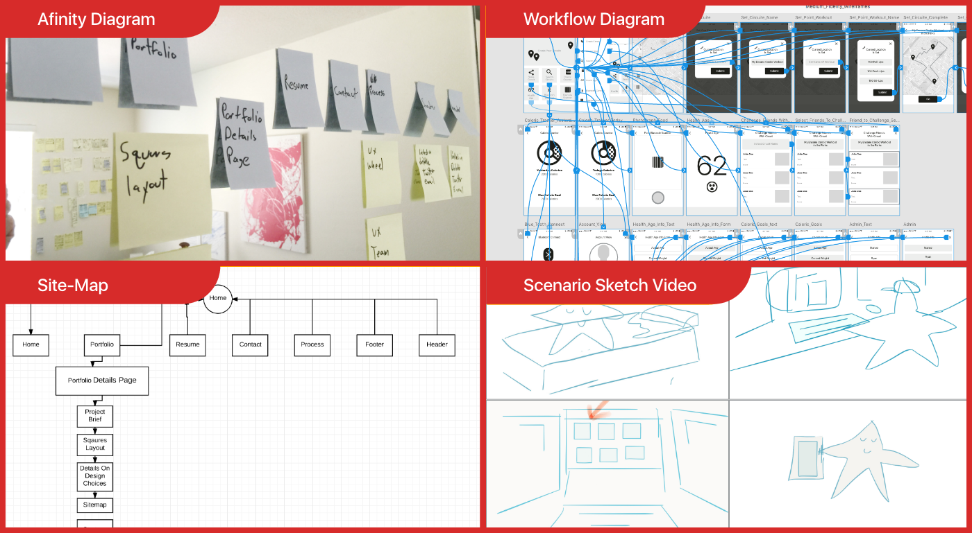
Affinity Diagram
After I completed my research and I felt I had a good idea of how I wanted to create a mobile app solution I came back to the studio and began creating an affinity diagram. I began creating the affinity diagram by imagining myself using an imaginary mobile app. For each step of the mobile app that I imagine myself walking through I place a blue colored Post-it. For any additional ideas that I want to add to an already existing page such as photographs, illustrations, icons, layout style, etc. I place a yellow Post-it directly below the blue Post-it. Lastly I go back and place all of the items from the affinity diagram in order of greater importance to least importance.
Site-Map
After the affinity diagram was created I converted the diagram directly into a site-map using a site-map software called Lucid Charts. The affinity diagram was easily converted into a Lucid Charts Site-Map Software that I could easily modify as additional work is added throughout the UX Wheel iteration process.
Scenario Sketch Videos
My scenario storyboard videos consisted of small cartoon characters that I drew and that were placed in various scenarios simulating how a user would use the Social Spring mobile app. After all of the storyboards were completed I placed each of the storyboards into a video program called Adobe Voice. I than add voice over to each of the storyboards. Next I played the videos to people outside the UX Team to observe the viewers find items that would considered errors or mistakes. If I consider the viewers errors, mistakes or ideas valuable, I add them to the site-map.
Arrange By Priority
I go back and arrange the ideas in the site-map by order of importance so that the most important items receive the most focus and the least important items can be either removed or placed in areas where they will provide the most important content, relative to the users navigational location in the site-map.
Workflow Diagram
If I am working with a UX Research team that understands how to make a workflow diagram using a simple sketch application, this can serve as a bridge to to the UX Design and Prototype team. In the past what has actually been used here are hand sketches that I have taken photographs of and than placed into PopApp to simulate them as if they were a real mobile app. PopApp made the Workflow Diagram much easier to follow and allows the entire team to be on the same page much easier.
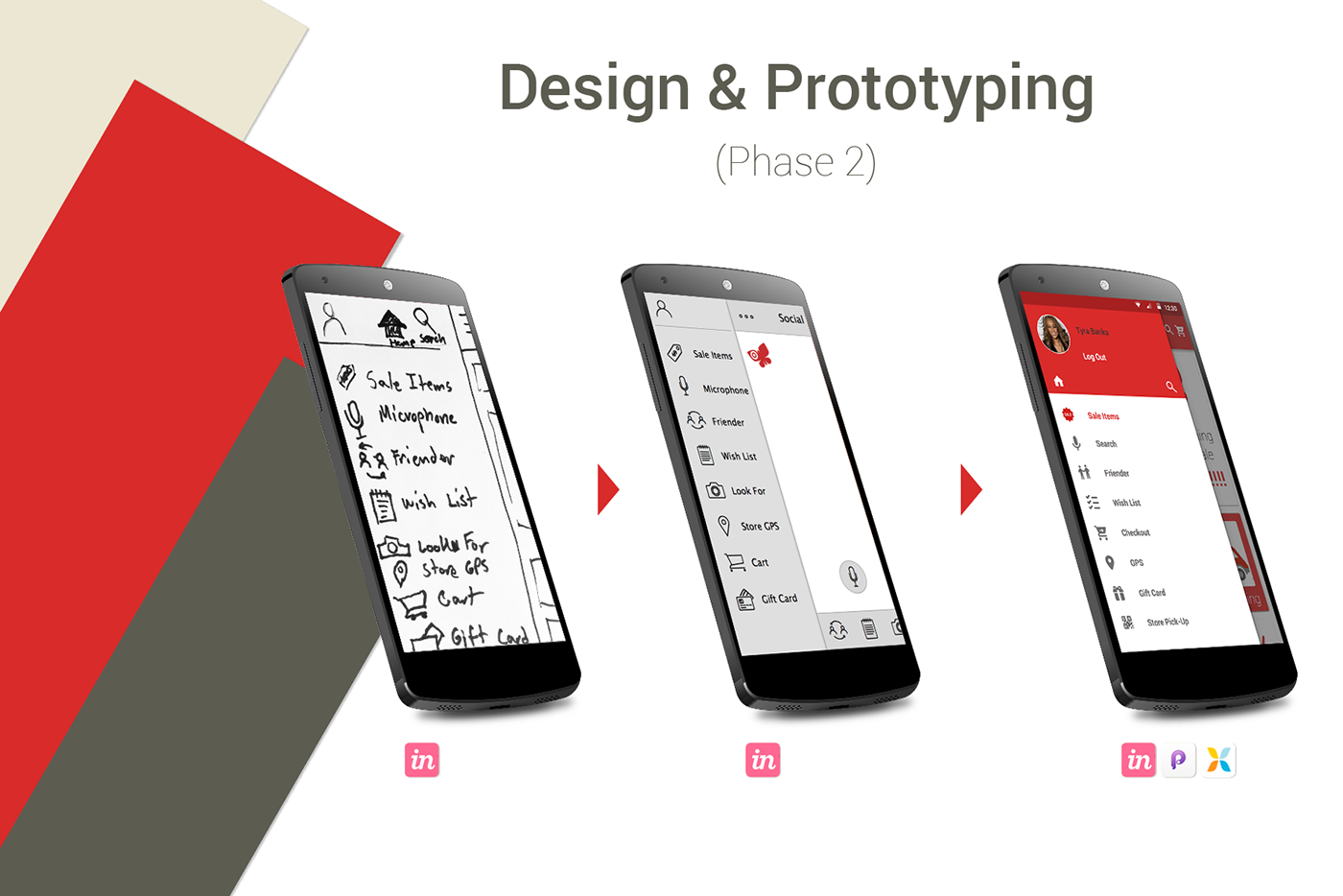
Design & Prototyping (Phase 2)
Low-Fidelity Sketches
The UX Design team is handed a site-map as well as any rough wireframes and other communication material, to convey new ideas that have evolved to solve problems in the UX Research Team.
Now the rapid prototype phase begins using white board sketches, sketch pad sketches and sketches placed on Post-it notes as a bridge for quickly communicating ideas or clearing up any confusion between the UX Design & Prototype team and the UX Research team. Photographs are then taken of the sketches and imported into a mobile app called PopApp. The low fidelity wireframes are stitched together creating a quick simulation of a mobile app. This form of low fidelity rapid prototype eases communication between all of the UX and Marketing team members and places the entire UX team on the same page of understanding very quickly.
Now the rapid prototype phase begins using white board sketches, sketch pad sketches and sketches placed on Post-it notes as a bridge for quickly communicating ideas or clearing up any confusion between the UX Design & Prototype team and the UX Research team. Photographs are then taken of the sketches and imported into a mobile app called PopApp. The low fidelity wireframes are stitched together creating a quick simulation of a mobile app. This form of low fidelity rapid prototype eases communication between all of the UX and Marketing team members and places the entire UX team on the same page of understanding very quickly.
Medium-Fidelity Wireframes
Medium fidelity wireframes were used to quickly create an entire basic working draft that included all of the specifications and guidelines presented by the marketing team and the UX Research team. This process is was done quickly in the time slot of about 1 or 2 days.
Hi-Fidelity Wireframes
The high fidelity wireframes were created to depict the pixel perfect look and styling that would be used for the actual mobile app prototype to be used in the testing phase.
Hi-Fidelity XD Prototype
As the high-fidelity wireframes were being created I was able to simultaneously create a high-fidelity frame to frame style prototype in Adobe XD. This style of prototype was viewed by the entire UX team and modified until the entire look was agreed upon.
Hi-Fidelity Micro-Animation Prototype
A high-fidelity micro-animation style prototype was created in the more advanced motion graphic prototype tool called "Principle for Mac." This final Principle style prototype was created and placed on a real mobile phone to simulate a real mobile app and used by a user tester for the testing phase.
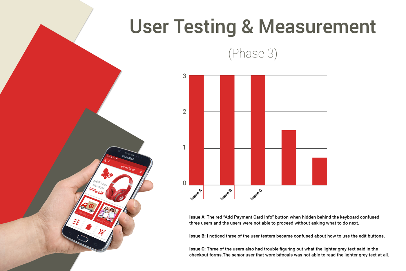
User Testing & Measurement (Phase 3)
About The Final User Testing & Measurement
For this phase observational user testing was done with five user testers. The reaction that I received from the user testers was extremely positive. I found several small issues that were found to be real issues and they were re-introduced back into the UX Wheel for re-evaluation. After modifications were made to increase the simplicity of the use of the mobile app for sections with issues and the issues were proven to work more smoothly, the UX Team came to the final conclusion that the app was complete.